|
| Candace Nirvana - 121711 |
Awhile back blog friend Carla suggested in a comment I write about why I choose to create photos in black and white or color. I've been thinking about it now for a few weeks and it comes down to one question, "Which works best for what I need?" I know that sounds so simple to be almost trite, but the answer is the basis of all my art and the subjective power of the medium.
When I shoot digital, I always shoot in color*. Most of my photos instantly lend themselves to color, black and white, or some subdued middle ground instantly. This may be due to elements being too distracting or ruining the image if not changed over. Since the answer is usually pretty obvious, the BW vs color choice is pretty easy.
For some of my photos, it is much harder to choose the final output. The image works very well in either format. At this point I have to ask
- What the intent of the photo is?
- Is it part of a series that is in one treatment or the other? Does it matter if it is different than the rest?
- Am I concerned about texture, pattern, line, shadows and graphic details? Yes, go desaturated or BW.
- Is the color a or the component to the image? Yes, go color. I may even have to emphasize certain colors and play with saturation and color channels to get it just right.
Think of a sunset photo. I bet it is a color photo. Now think of a photo of woman carrying an umbrella on a cold rainy day in Dublin. You probably can better imagine that in black and white.
Sometimes I choose one over the other because of the feel it gives off. For me, BW can "feel" more factual while color can "feel" more abstract and multidimensional. This is not a golden rule for me, but for a recent series, I wanted the feel that black and white gave as a sense of documentary of the emotions of the people in the photos even though the whole series is conceptual and highly interpretive. I wanted people to really focus on the emotions on the faces. The photo of Valya in the bed works in black and white so much better for me because of the emotional feel conveys so much better desaturated than in color.
 |
| Valya - 121711 |
 |
| Valya - 121711 |
 |
| Jacqui - 121711 |
 |
| Jacqui - 121711 |
The photo of Jacqui in the truck only works in color for me. I saw how her dress, my truck, and the rich blue California sky worked so well together. The photo has strong directional lines that would lend well to a black and white photo, but obviously color is the best choice. Compare this to the photos of her wearing just a white dress while sitting in the same truck. For those, black and white was my only choice.
 |
| Jacqui - 121711 |
 |
| Jacqui - 121711 |
Sometimes I have a hard time deciding which is best. I ask other photographers for their thoughts, but this usually has mixed results. Some like color, others like the black and white better. The photo of Jacqui below has had about equal votes for both treatments. In the end, I will have to decide which works better for what I need it for. I have to answer the four questions above to help me divine the answer.
 |
| Jacqui - 121711 |
 |
| Jacqui - 121711 |
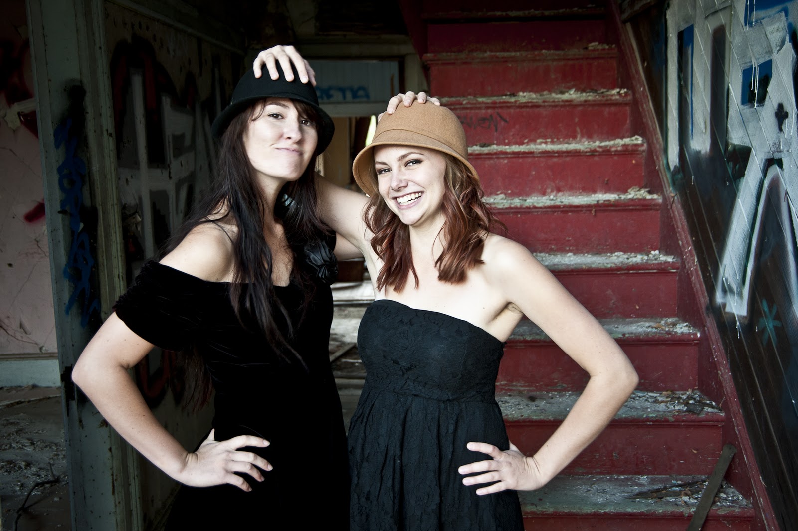
Do I have a predelection for one treatment over the other. It depends on my mood, my life experiences at the time, and if I am excited or bored with the treatment. I learned to photograph using black and white film, developing it, and making wet prints from it. I feel that may give me a bit more of a push toward black and white, but I still like both. By learning to shoot in black and white, I learned key components of line, shape, pattern, contrast, and other BW elements that translate well to color photography and make those images better.
Below are pairs of photos with both treatments. Feel free to share comments if one works better than the other for you and why that is so.
*The basic reason to photograph digitally in color RAW and then convert to black and white instead of just using the camera's black and white settings comes down to shades of grey. When you use your camera's internal BW setting, it limits the captured image to 256 shades of grey, but if you shoot in color the sensor captures 256 shades of blue, red and green each. If you multiplied 256X256X256, you get the total number of different colors captured - 16.8 million different colors. When you convert the photo from color to BW on your computer, each one of those captured colors will have slightly different shades of grey from each other. Your BW image will have much greater tonal range and look richer.
 |
| Candace - 121711 |
 |
| Candace - 121711 |
 |
| Jacqui - 121711 |
 |
| Jacqui - 121711 |
 |
| Courtney - 121711 |
 |
| Courtney - 121711 |
 |
| Palm Springs - 121711 |
 |
| Palm Springs - 121711 | | |
 |
| Candace - 121711 |
 |
| Candace - 121711 |